This was the original flat plan for my front cover, however during the first several drafts I altered the structure because I wasn't completely satisfied with my flat plan. However, as I carried out further research into indie music magazine front covers I realised that my flat plan followed typical genre conventions significantly closer than my front cover, so I changed the layout of my front cover.
Tuesday, 7 February 2017
Monday, 6 February 2017
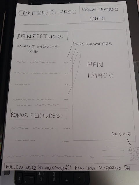
Contents Page Flat Plan
Sunday, 5 February 2017
Double Page Spread Flat Plan
As with my contents page, the flat plan for my double page spread is a little outdated when compared to the final version of my double page spread. Again, the structure of my double page spread was altered to closely follow genre conventions, and the inclusion of a rabbit mask gave my media product uniqueness and originality.
Friday, 3 February 2017
Artist Profile
Before the creation of my double page spread, I considered how I wanted my artist/model to be represented in this piece of work. From my research I knew that women aren't typically featured in indie music magazines, but when they are it is usually in a sexualised way. I tried to follow this convention with my front cover, which can be seen with the positioning of Ambers hand on her lips. This can be seen as supporting Laura Mulveys' theory (1975) which argues that 'females are sexualised and presented as objects of desire for the male audience'.
I wanted my media product to have originality and uniqueness, which is why I used a rabbit head in my most recent photo shoot. I used what I considered to be the most effective and of the highest quality image, and positioned it on the left hand side of my double page spread to follow typical layout conventions. The pink filter is an additional feature of excitement, and draws more attention to the rabbit head.
The inclusion of a rabbits head improved the quality of my images and will hopefully make my media product stand out from the rest. In the first draft of my double page spread, I used the picture that is now presented on my front cover. With this photoshoot the image quality was significantly poorer, and whilst the images followed conventions, I felt as though my double page spread could be greatly improved. This improvement has hopefully been successful, and my representation of Amber has changed because of this alteration. Amber is given a slightly sexual representation in my front cover and contents page, but the rabbit mask makes her appear intense and menacing in the double page spread.
Edited Photos
As evidenced below, I had to alter the lighting and levels of my first photoshoot to improve my images. However, due to the successful lighting with my improved photoshoots I didn't have to edit and adjust my photos in as much detail. Regardless of this, I adjusted the saturation level to bring out more colour in the image. I also adjusted the levels in each of my images to make the images brighter and reduce any dark shadows occurring. With my new photo-shoot with Amber wearing the rabbit head, the image quality was significantly greater in comparison to my older photo-shoots, so I didn't feel like I needed to edit these images. I did experiment with adjusting the brightness, saturation and levels etc. with my rabbit images in Photoshop, but this decreased my image quality and gave the photos a grainy appearance. You also weren't able to see the pink filter as clearly.
Actual Photos
Below are all of the original images from my photoshoots. My first photoshoot followed the appropriate genre codes and conventions, but the lighting wasn't of the best quality, which made it difficult to make my media product to the highest standard possible. My second photoshoot was a significant improvement to my first photoshoot, as the photos had better lighting and the inclusion of a rabbits head gave my images more uniqueness and originality. The use of a pink filter in my new photoshoot also gave my images originality, especially when incorporated with the rabbits head.
Subscribe to:
Posts (Atom)